
Initial Project Overview
For a college design course project, we were instructed to conduct research on an industry of our choice and design a fictional company logo based on what we observed in trends and styles related to that industry. Then needed to design a business card, letterhead and promo/apparel mockups for the company logo that was created based on previous research.
Overall Brand Rationale
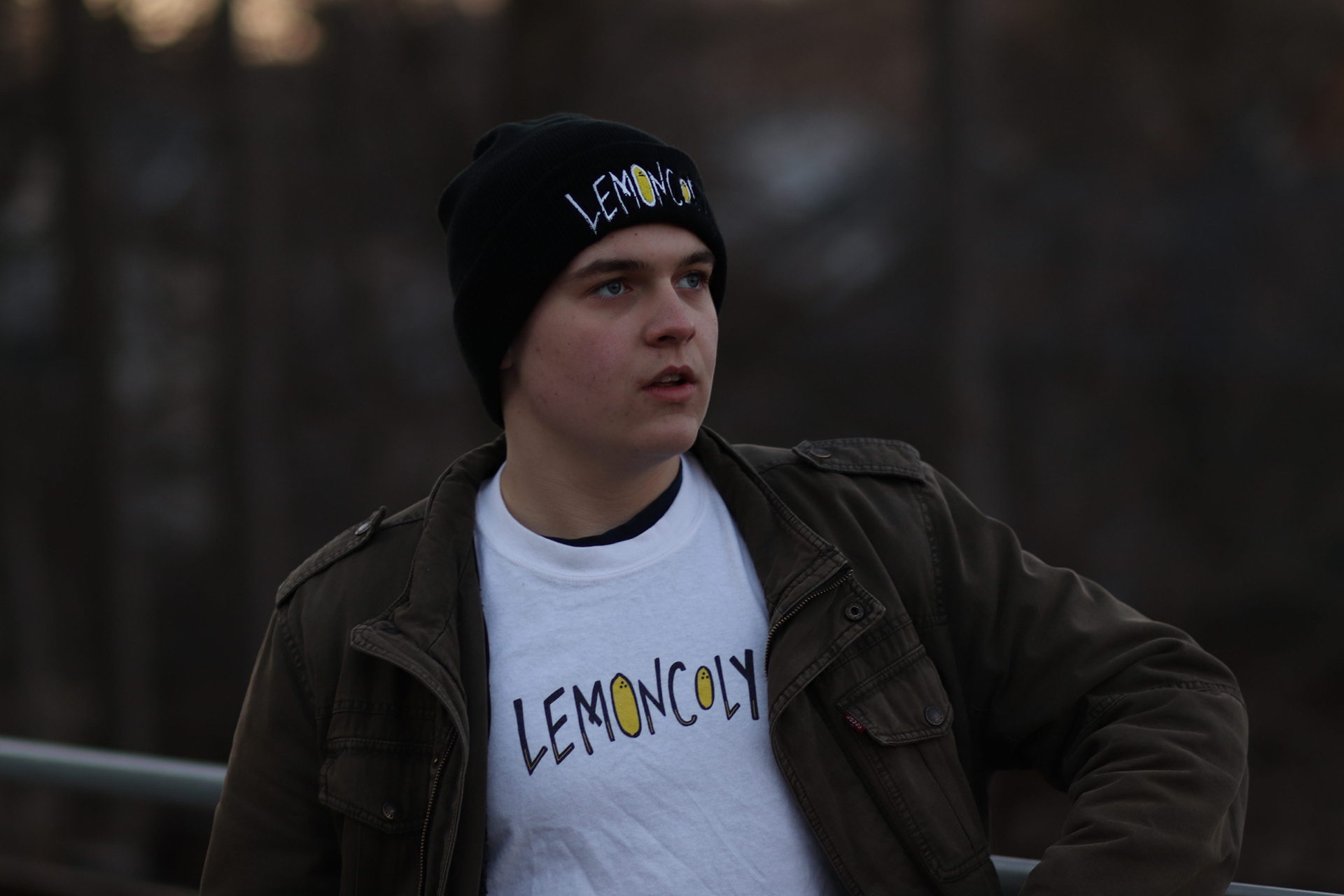
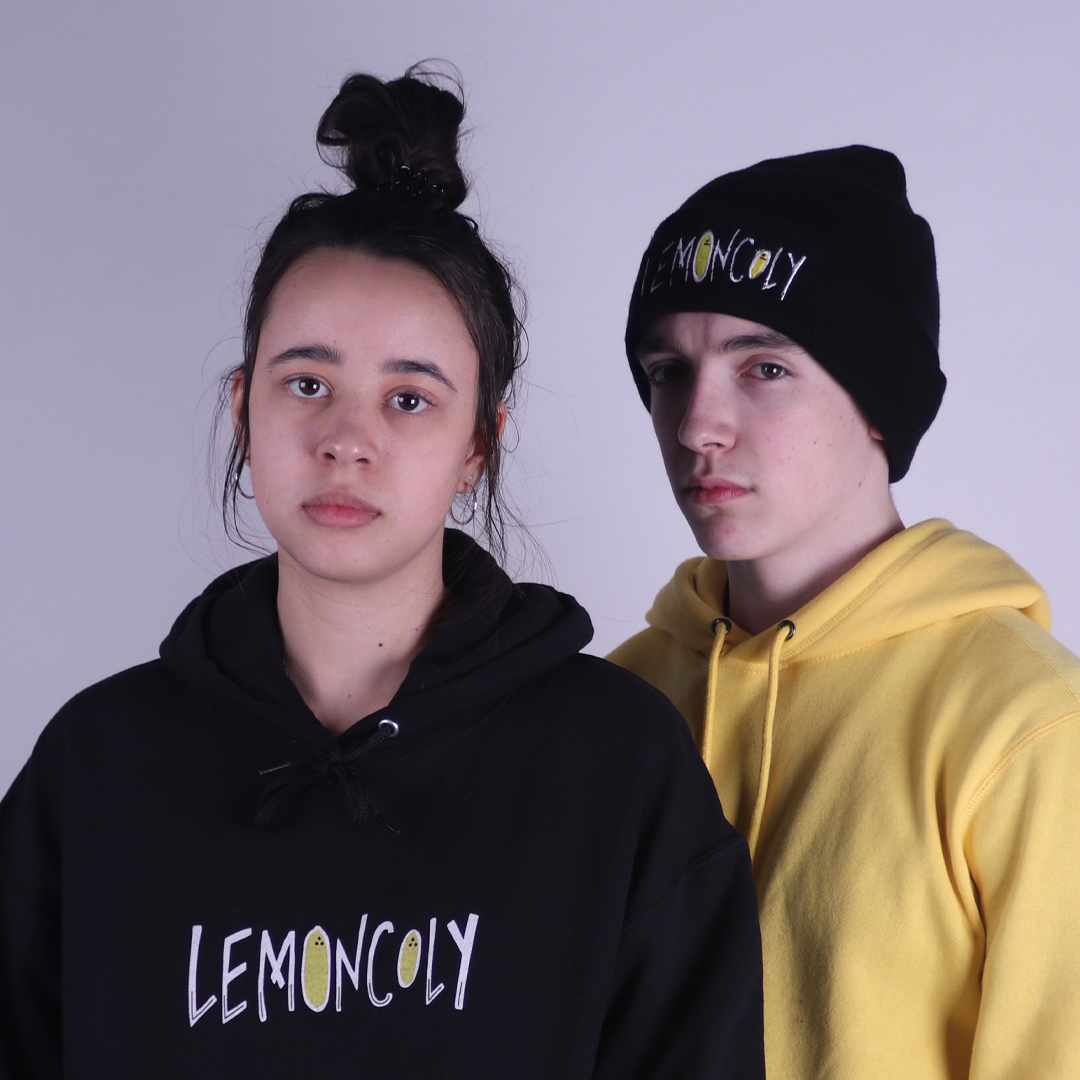
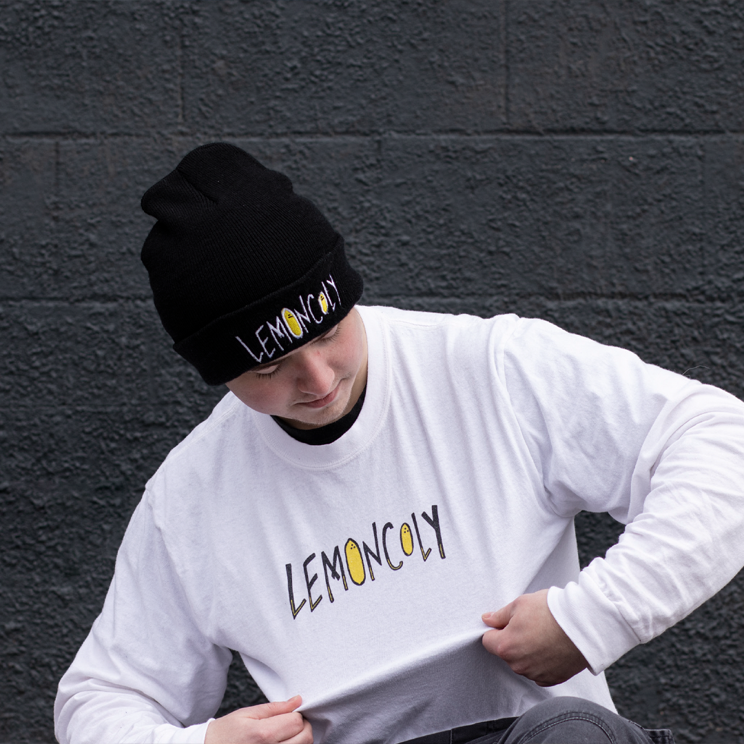
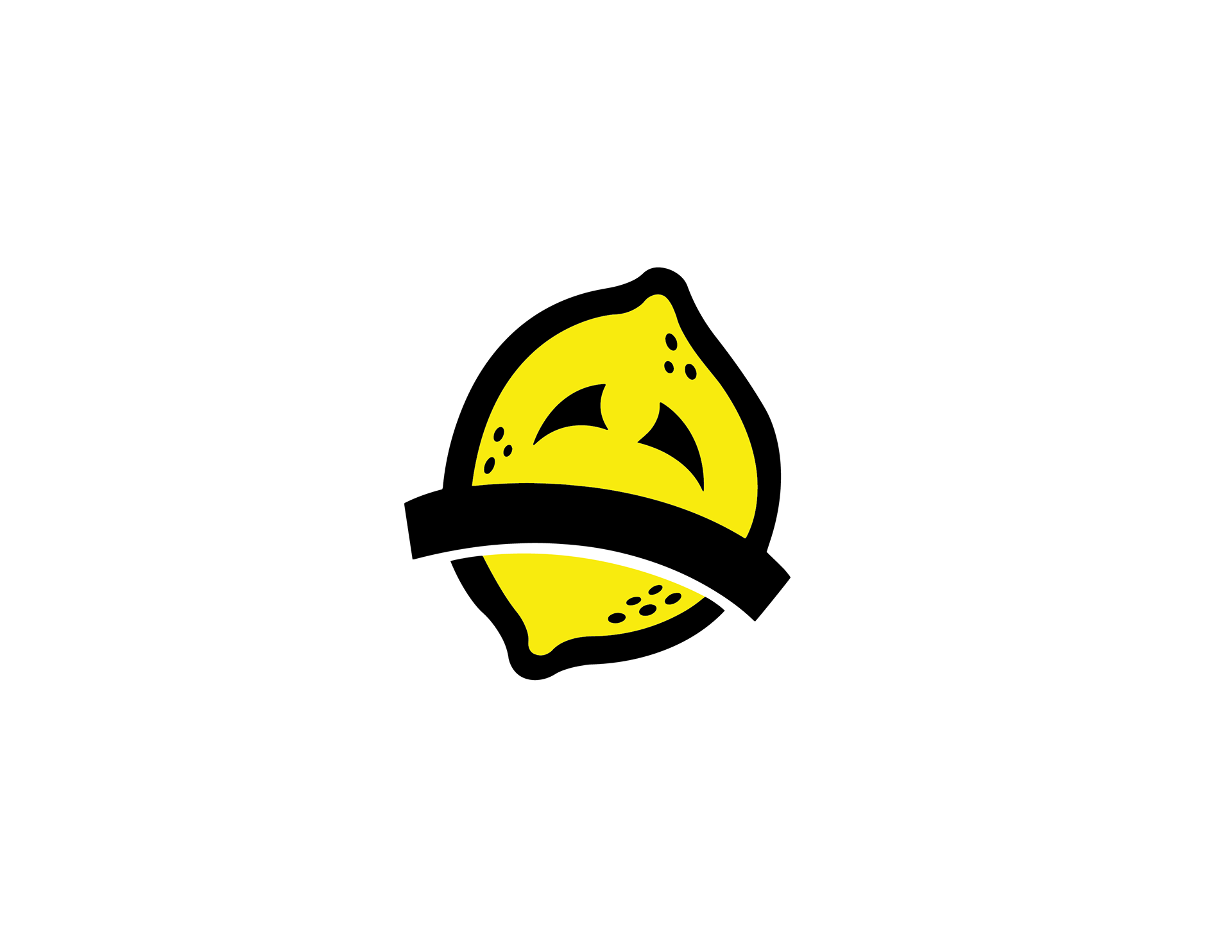
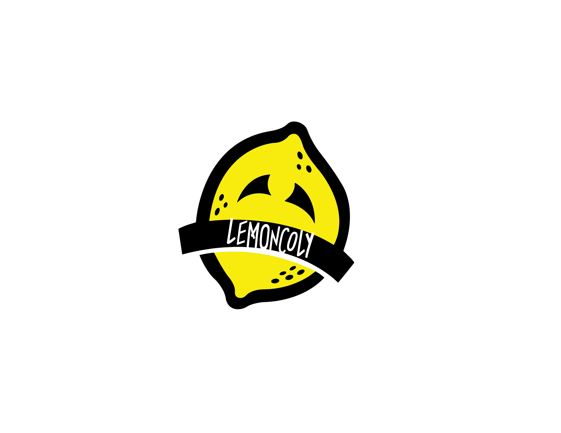
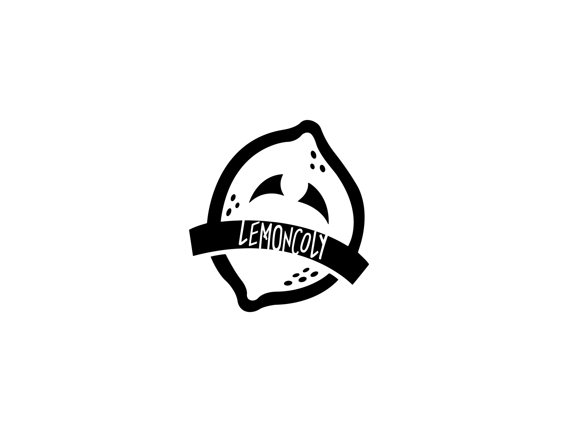
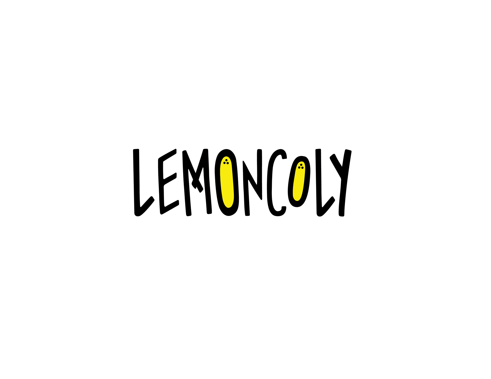
The fictional clothing company I created is called Lemoncoly. The name is a combination of the words lemon and melancholy with a slightly different spelling. The idea was to appeal to young people who tend to feel a lot of random sadness from time to time with no particular reason. The lemon comes from the common saying, “When life gives you lemons…” and many people have their own ways of ending the saying. When life gave one lemons, I created a brand to bring awareness to mental health issues because even when life seems to be giving you so many great opportunities and to others it may look like you have everything lined up for yourself,
you can still be depressed and be struggling silently. Lemoncoly aims to help break the silence and help support those who need help.
you can still be depressed and be struggling silently. Lemoncoly aims to help break the silence and help support those who need help.
Research Summary
The chosen industry that was focused on was grunge/skater clothing style. Research was conducted on where it originated, what defined the style, and what the style looks like today. I chose to focus on this clothing industry because this style has been regaining popularity within the ages of 14-24 over the past decade. The idea was to look at what the most popular brands and retailers are within this industry and create a logo that was unique and stood out among the others but still belongs within the skater/grunge style.
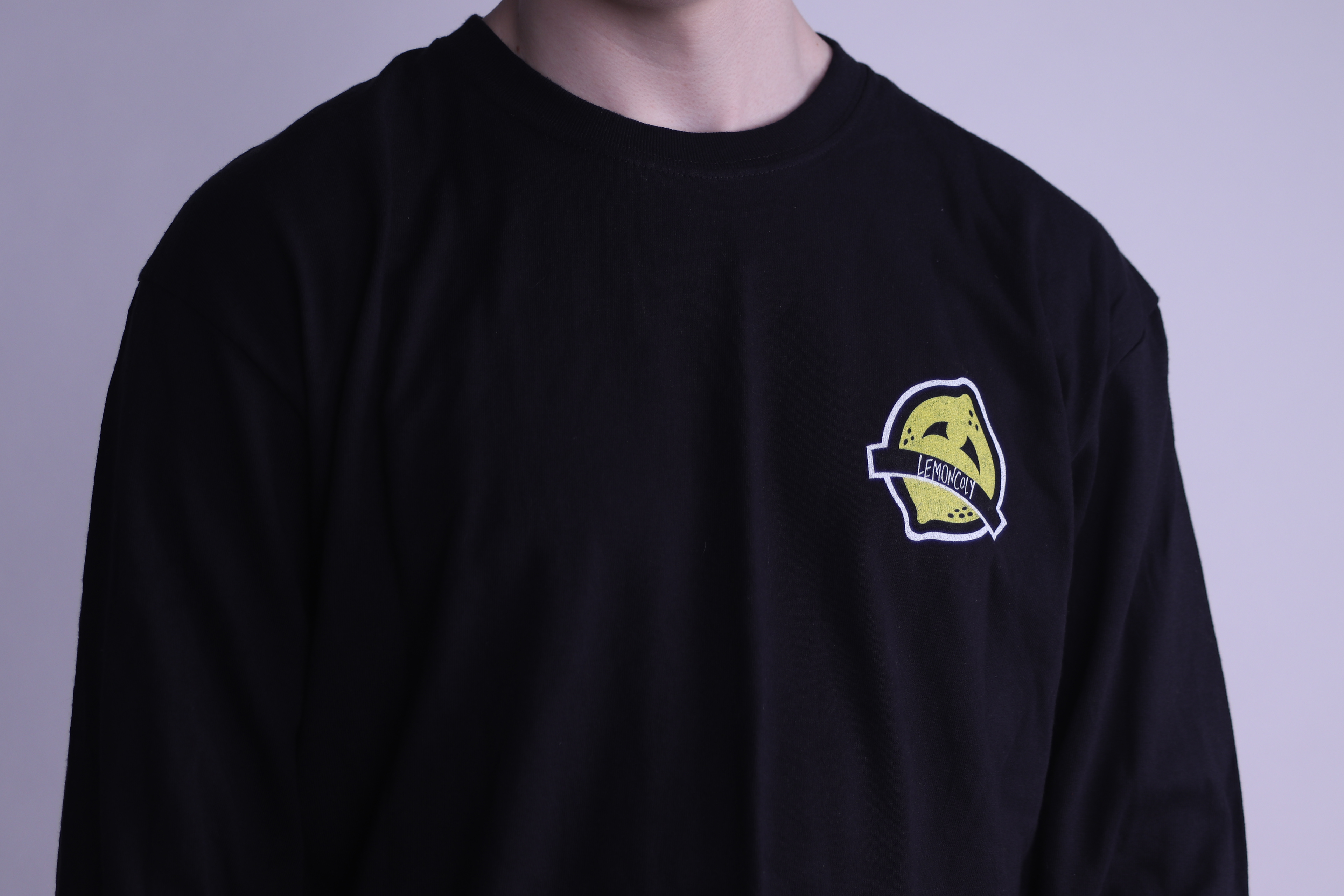
After analyzing the commonalities between the competitors logos, it was noticeable that they commonly used purely typographic logos for their corporate stuff, and had a simple distinguishable add on that could stand alone to represent their brand on apparel. Some brands only used the typographic logo on both corporate items and apparel items. Some examples of competitors that are purely typographic are Zumiez, Vans Canada, and OBEY. However, despite having strong company logos, they all typically have multiple different styles of their logos for apparel.
After analyzing the commonalities between the competitors logos, it was noticeable that they commonly used purely typographic logos for their corporate stuff, and had a simple distinguishable add on that could stand alone to represent their brand on apparel. Some brands only used the typographic logo on both corporate items and apparel items. Some examples of competitors that are purely typographic are Zumiez, Vans Canada, and OBEY. However, despite having strong company logos, they all typically have multiple different styles of their logos for apparel.
Designer Notes
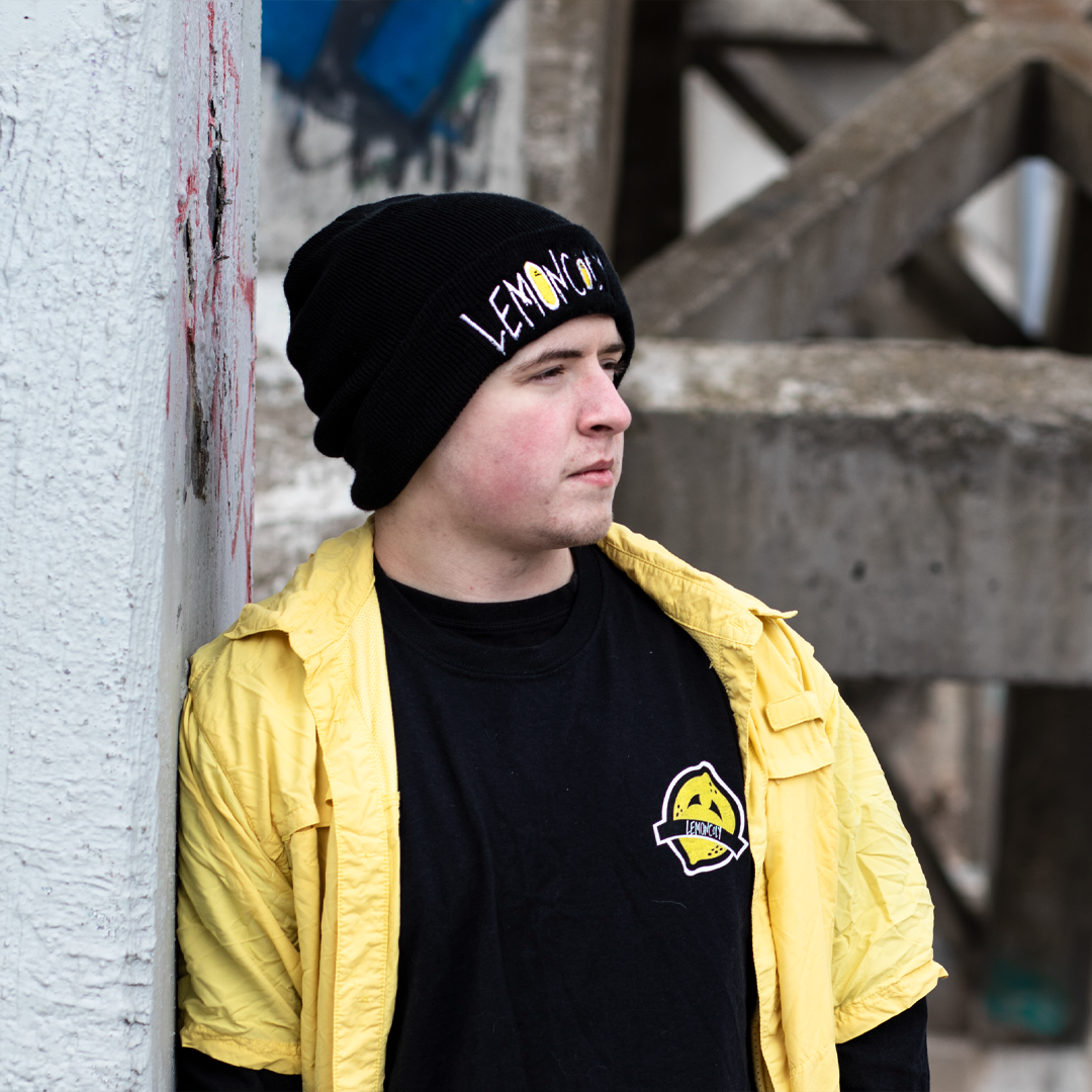
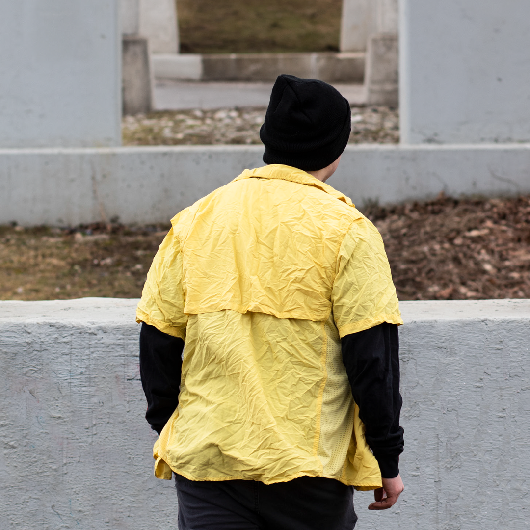
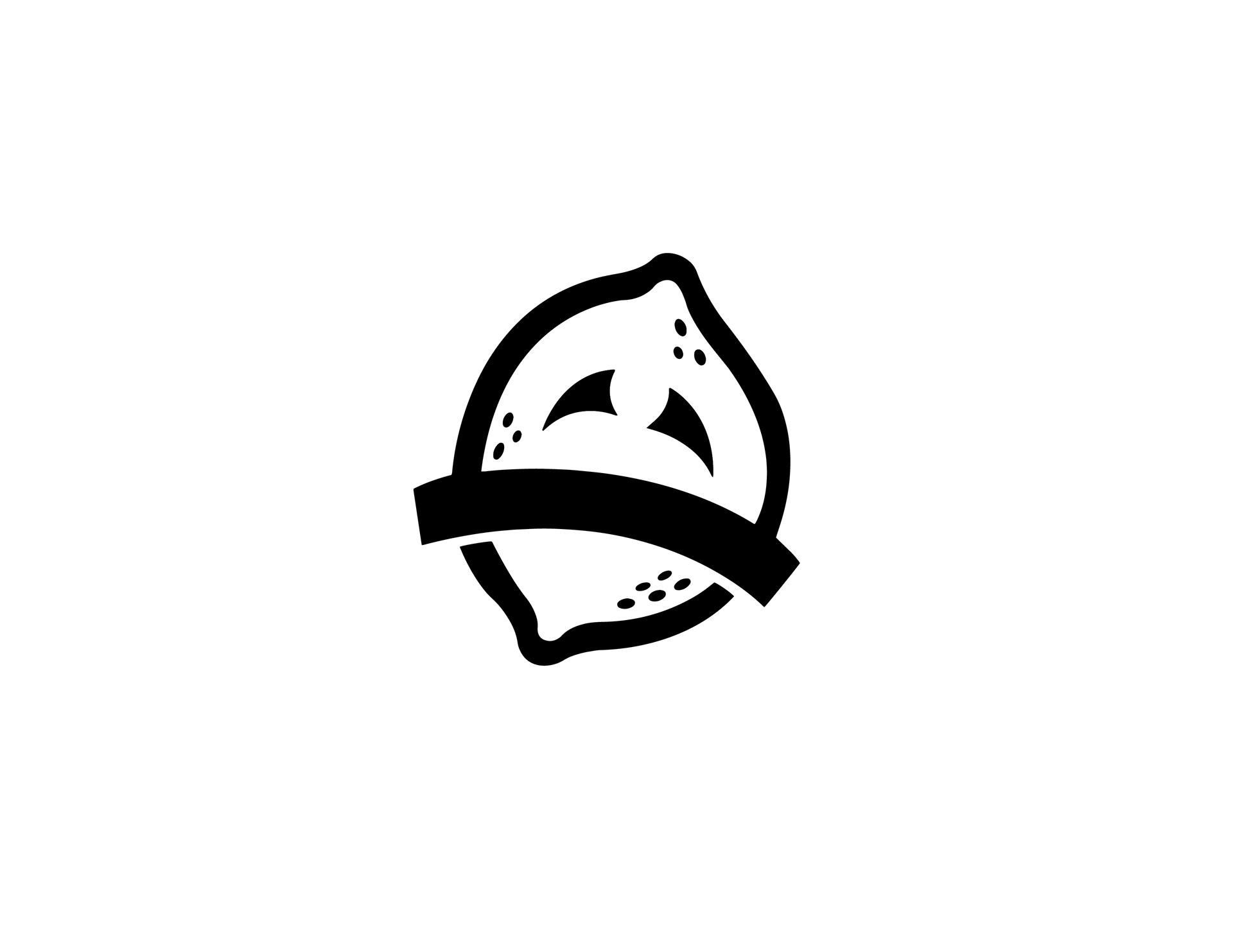
The symbol that was created for part of the logo was designed so that it could one day exist on its own once the brand is well-established. The symbol itself is a play on the name, a whimsical take on a lemon that has been personified with a largely planted sad face. The typography is inspired by graffiti writing and the hand drawn aesthetic that was common in other companies apparel lines. The colour scheme was easy, as black and white are very commonly used in this industry. One to two main colours that establish the branding of the company are also typically being done as well. So to keep consistent to the lemon part of the company, the acidic, lemon yellow was chosen to represent the companies one true colour besides the common black and white.
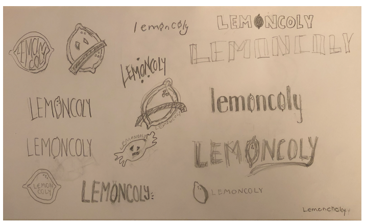
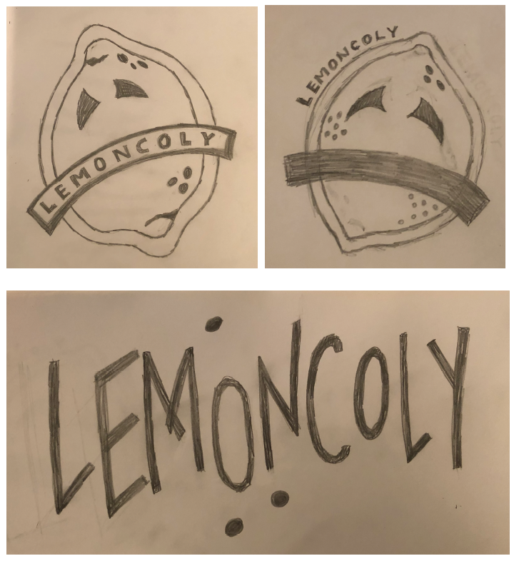
Logo Sketches
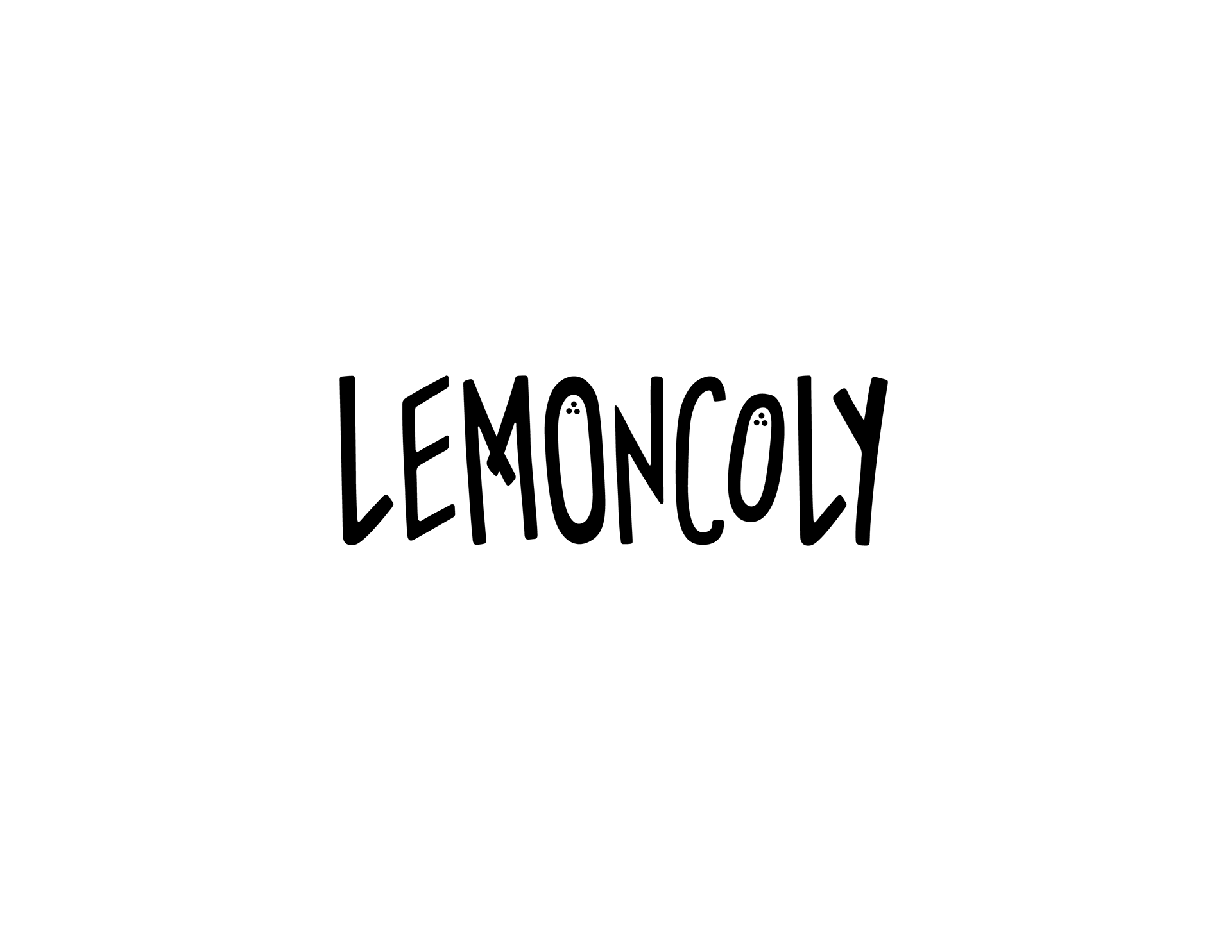
Updated Logos
Brand Guidelines